Toffee Studio — Blueberry Launch
A community-led mechanical keyboard release. I owned product design, packaging, visuals, web UX, creator seeding, launch operations, and post-launch support.
Release type
Group buy / pre-order
Channels
Creators · Discord · Forums
Deliverables
Packaging · Renders · Website
Scope
Product + Marketing + Web UX
Timeline
2021 → Launch + Fulfilment
Units
750+
Overview
Units Delivered
750+
Revenue
$227,000+ USD
Cumulative Reach
2,250,000+
Key Takeaways
- Creator reviews drove highest-trust conversions vs brand-owned content.
- Discord cadence reduced uncertainty and lowered repeat support questions.
- Packaging + visual system increased perceived value and improved unboxing clarity.
- Payment disruption forced a pivot; launch strategy adapted without losing credibility.
- Post-launch support protected trust: replacements, extras, troubleshooting, comms.
My Role
- Founder / Product + Marketing Lead
- Owned end-to-end execution
- Coordinated external PCB designer
What I Delivered
- Manufacturable CAD iterations
- Render kit for all assets
- Packaging system (v1 → v2)
- Creator seeding kit + outreach
- Discord community + launch ops
- Assembly guide website
- Post-launch support
Constraints
- Tight CNC/manufacturing tolerances
- Long lead times & prototype rounds
- Payment processor disruption
- QC failures requiring rework
- Momentum decay during delays
Go-To-Market System
A hardware launch built across creator coverage, enthusiast forums, owned web assets, and vendor distribution.
Creator Proof Pipeline
Objective: Establish third-party credibility before customers commit money.
Mechanism: Seed finished sample units and convert coverage into product-page proof and short-form snippets.
- Creator list and outreach plan (coverage fit, not just follower count)
- Creator-ready asset kit: renders, specs, packaging visuals, and “what buyers care about” talking points
- Coverage tracker and clip library for reuse on listings and launch updates
- Coverage volume, referral clicks to product page, and conversion lift during coverage window
Forum-led Trust and Updates
Objective: Reduce buyer uncertainty during long lead times and QC iteration.
Mechanism: Post structured updates on enthusiast forums with a consistent format, supported by a maintained FAQ.
- Update template: status, risks, next milestone, and changes since last update
- FAQ and “what’s in the box” modules to prevent repeated pre-purchase questions
- Assembly guide site to reduce post-purchase support load
- Repeated-question rate, support volume trend, and refund-request rate
Vendor Partnerships and Distribution Pivot
Objective: Recover demand and de-risk operations after payment disruption and fulfilment constraints.
Mechanism: Shift from direct-to-consumer to established keyboard vendors and adapt assets per channel.
- Vendor listing kit: image sets, copy variants, and spec sheet formatted to vendor requirements
- Allocation plan and “extras” handling via a separate store
- Channel-specific messaging that preserves brand consistency while meeting vendor listing formats
- Sell-through velocity by channel, support load change, and channel mix over time
Key Achievements
- 250,000+ GeekHack and Reddit forum engagement views
- 3,200+ wishlist signups pre-launch
- 1,100+ peak Discord server members
- 1,000,000+ total YouTube and community forum reach
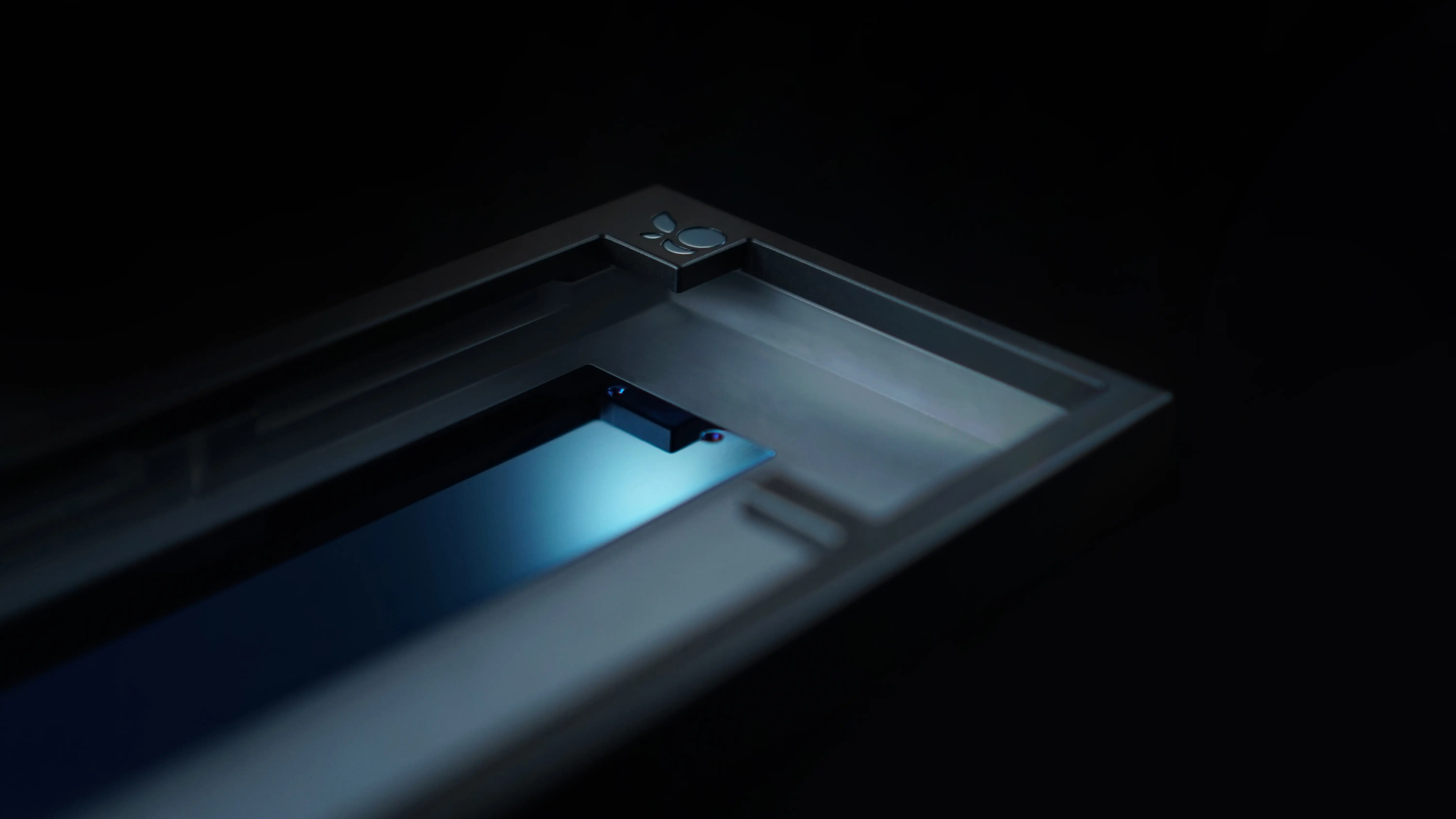
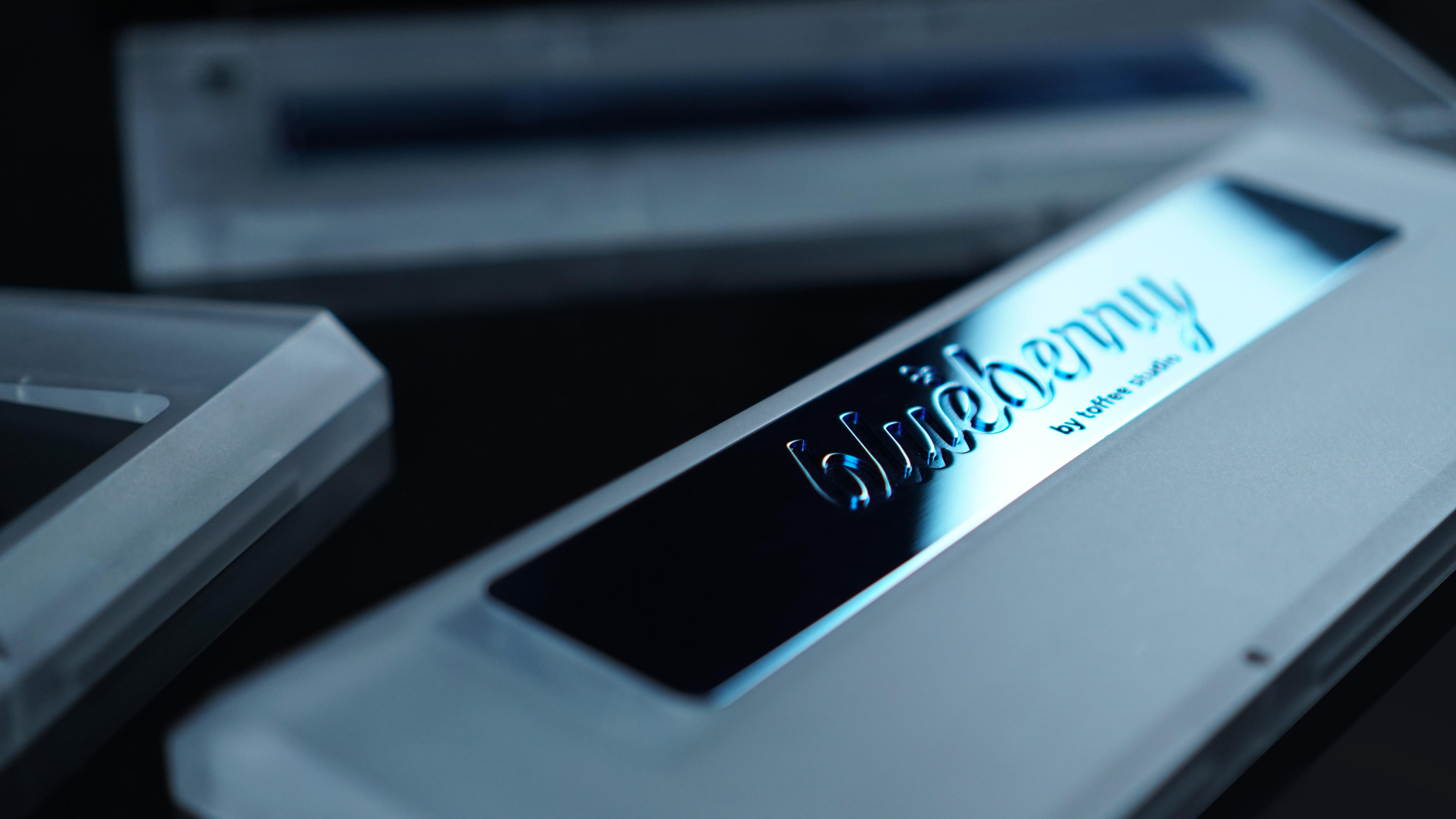
Product & Industrial Design
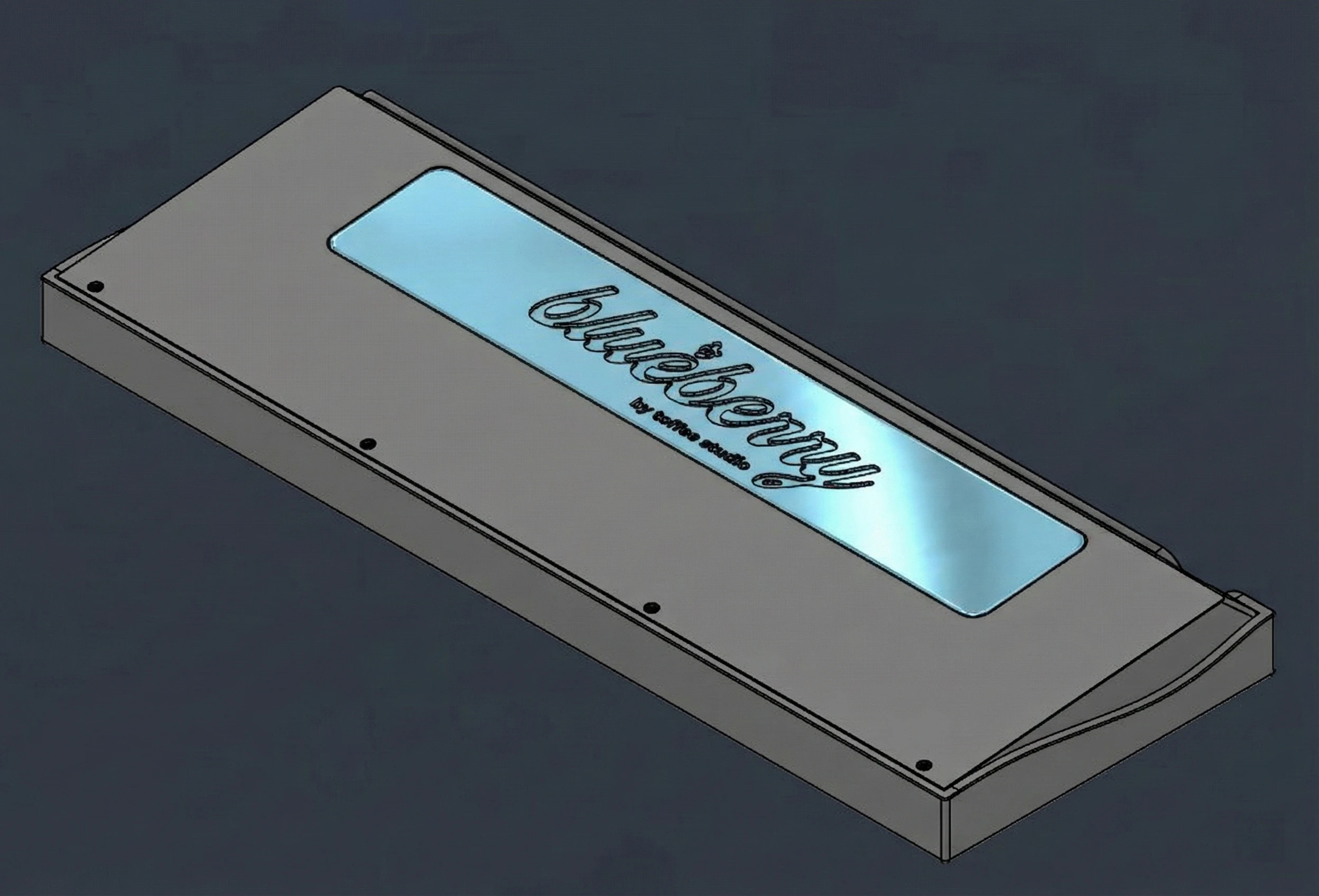
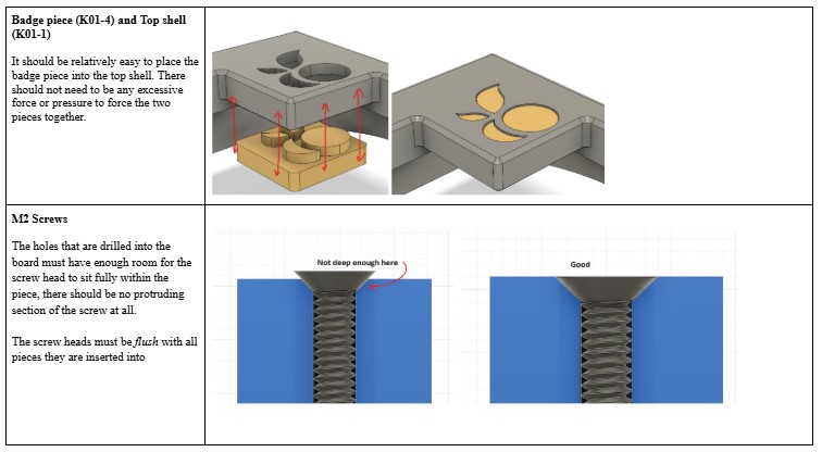
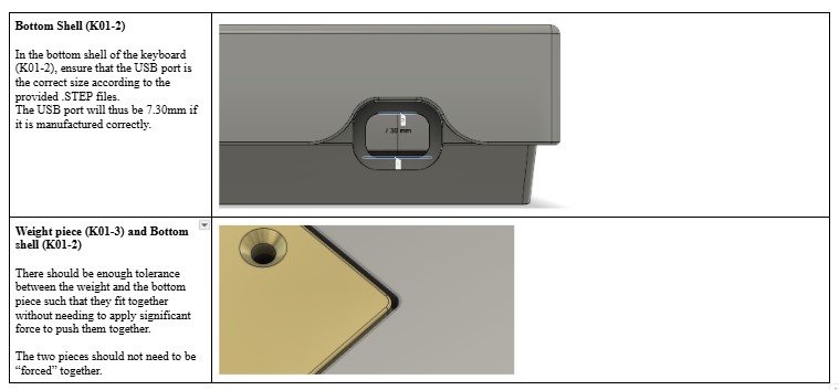
Blueberry was designed as a production-ready product, not just a render. My focus was translating a clean silhouette into geometry that survives CNC, finishing, assembly, and QC. That meant designing for tolerance stack-ups, protecting cosmetic surfaces, and building hidden clearance so the board feels precise without being fragile.
- GOAL: A quiet, premium silhouette with a recognisable top badge and a restrained profile that photographs well under different lighting.
- DECISION: Design the inside to protect the outside. I added deliberate internal clearance, keep-out zones, and contact protection so flex, fasteners, and PCB movement never telegraph into the exterior lines.
- CONSTRAINT: Manufacturing and finishing set the real rules. Tolerance stack-ups, anodising limits, and edge break consistency drove seam placement, corner radii, and how close features could sit to cosmetic faces.
- PRODUCTION ALIGNMENT: I owned the form language end to end, then worked with CNC and finishing partners to lock DFM constraints, define QC checkpoints, and iterate geometry until the design was repeatable across units.
Sketching the language
I explored the silhouette and badge placement as the product’s signature, then mapped the constraints early. Even at sketch stage, I called out seam candidates, edge breaks, and clearance paths so the concept could survive manufacturing.
Concept sketch: silhouette, seam candidates, and clearance thinking.
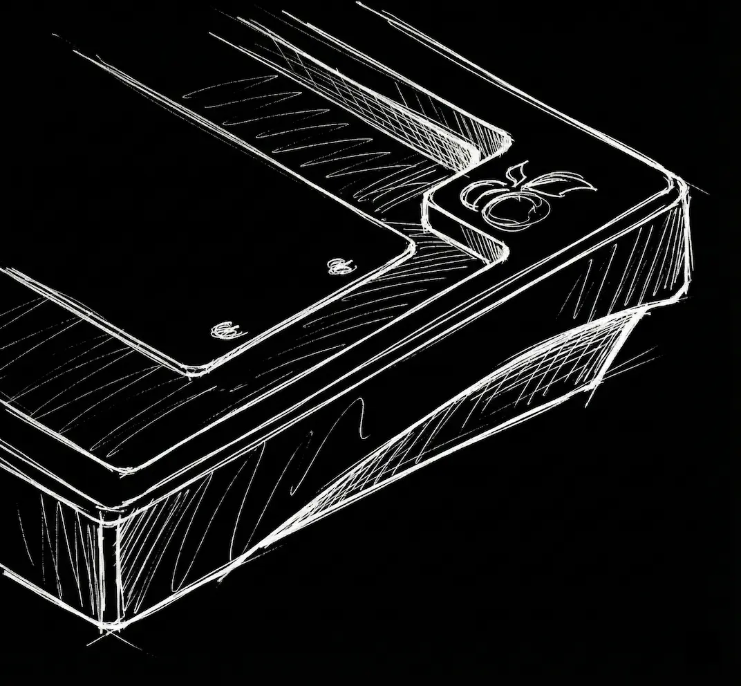
Detail sketch: badge placement and surface transitions.
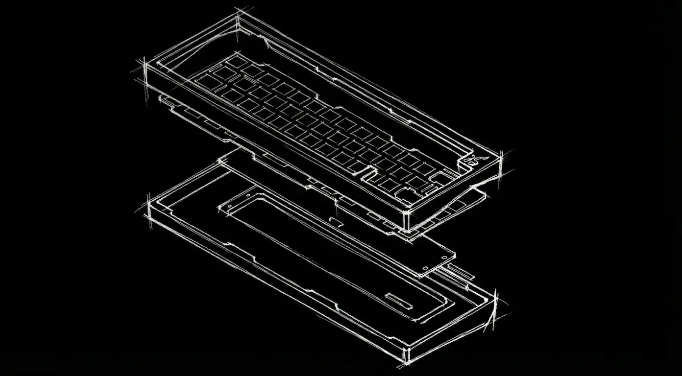
Building it in Fusion 360
I translated the direction into parametric CAD and designed for repeatable assembly. Key work here was controlling radii, defining keep-outs, and creating alignment features that reduce fit risk across PCB and case revisions.
Fusion CAD: proportions, radii, and assembly geometry locked.
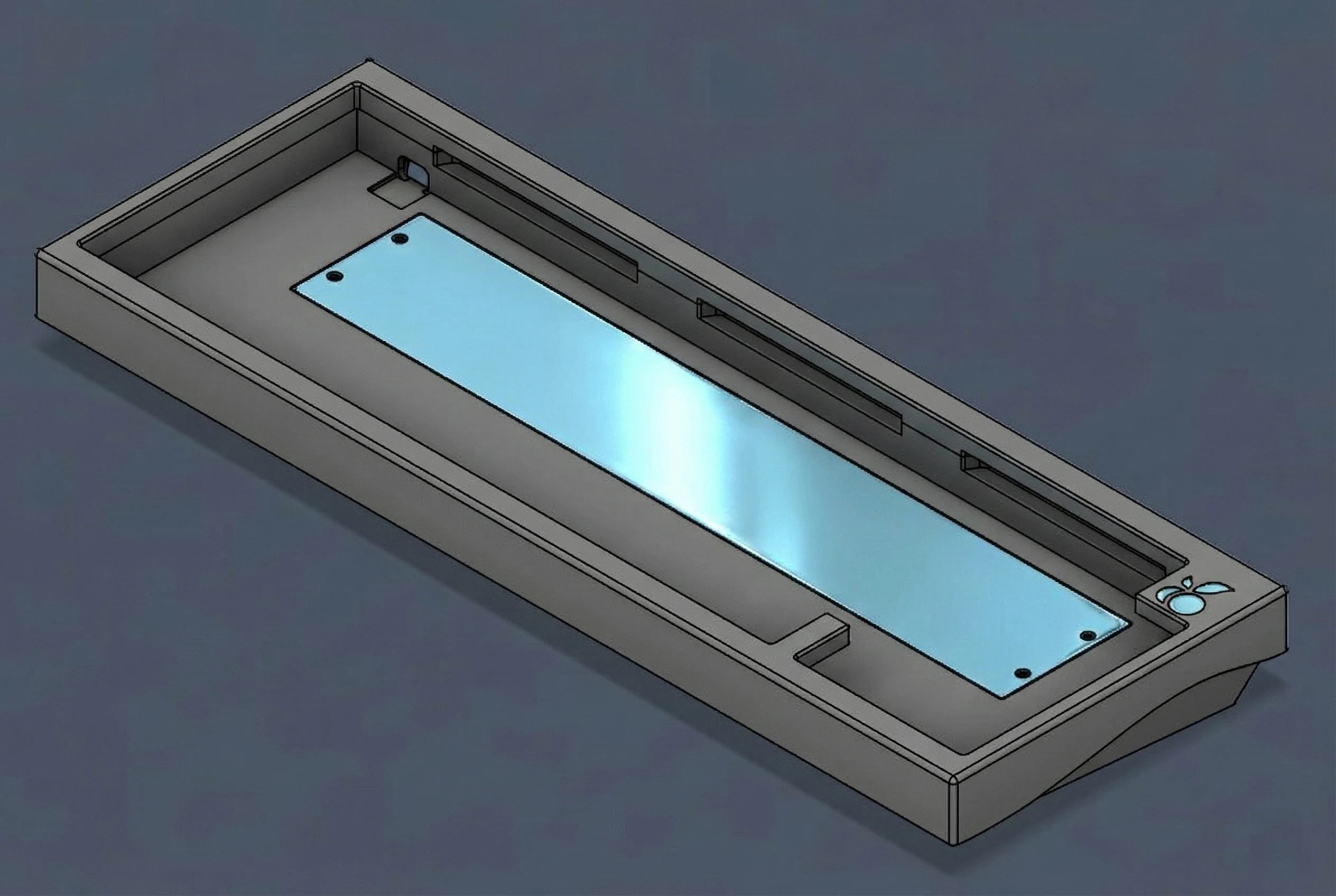
Fusion CAD: keep-outs and alignment features for repeatable builds.
Rendering
I produced renders as a decision tool, not decoration. I validated how materials and finishing would read under different lighting, and used renders to align creators, vendors, and packaging around a consistent product story.
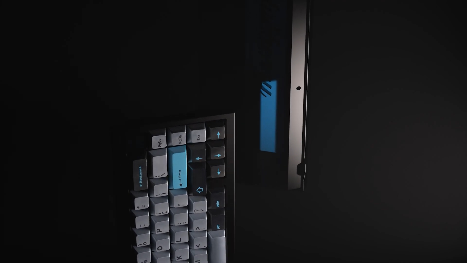
Render study: materials, lighting, and surface read checks.

Render study: badge reflectivity and finish behavior.
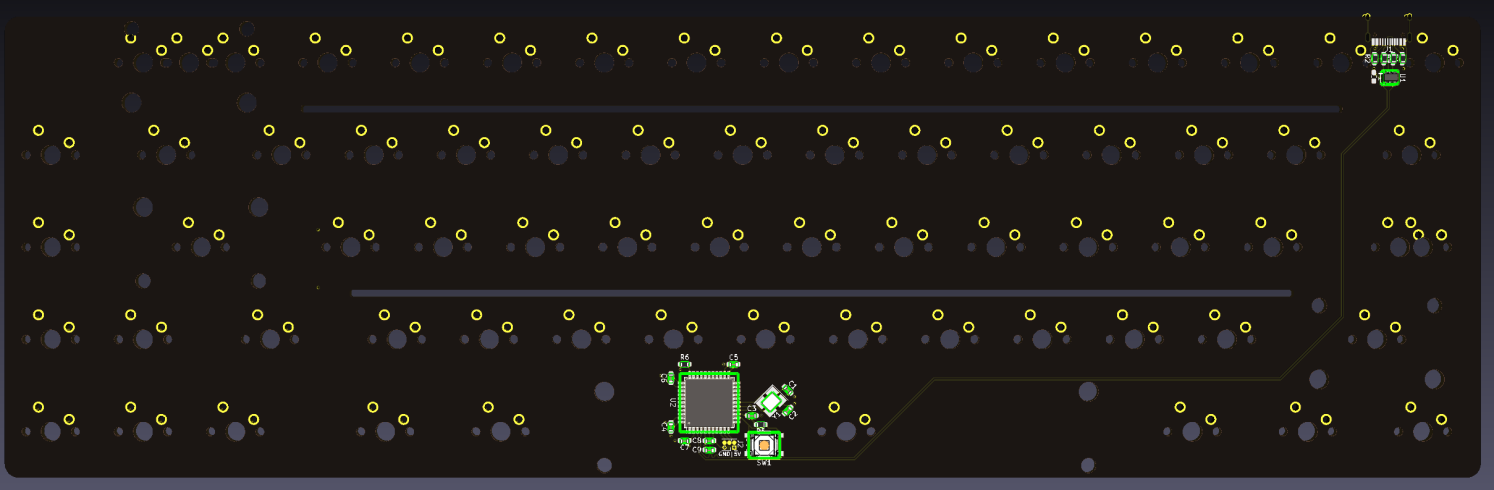
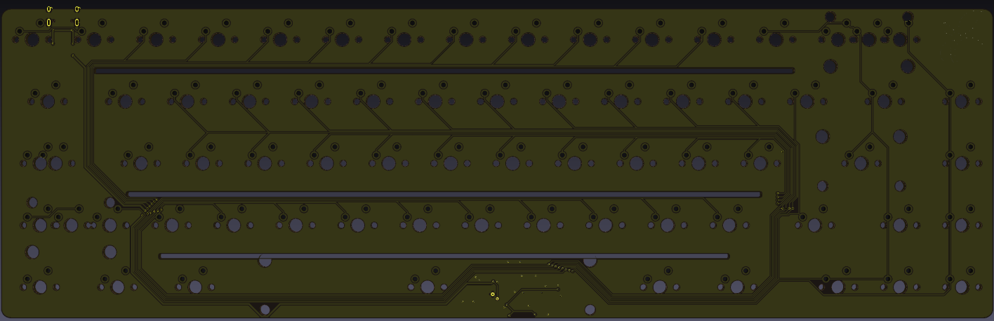
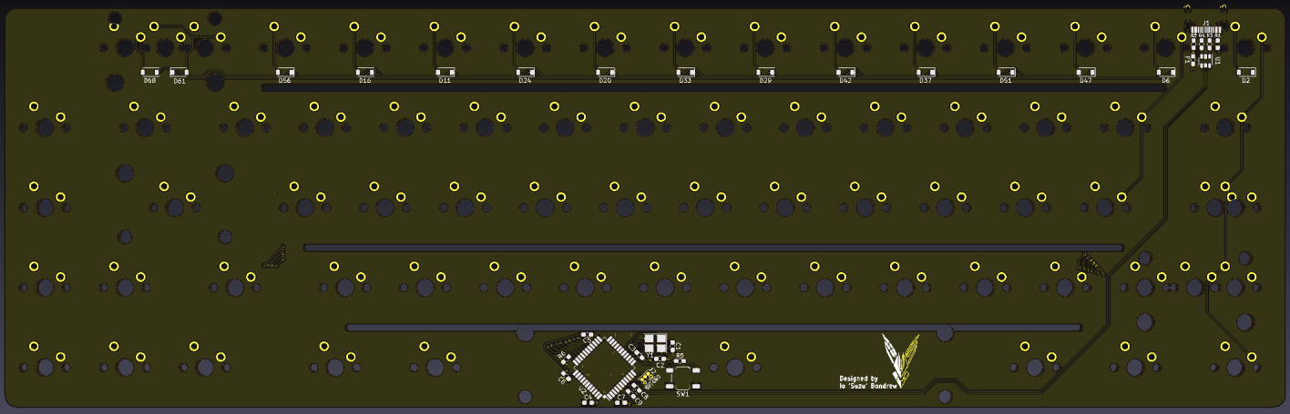
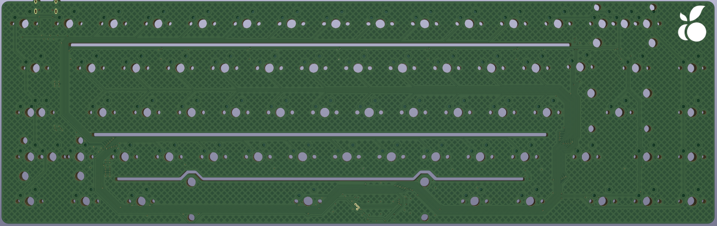
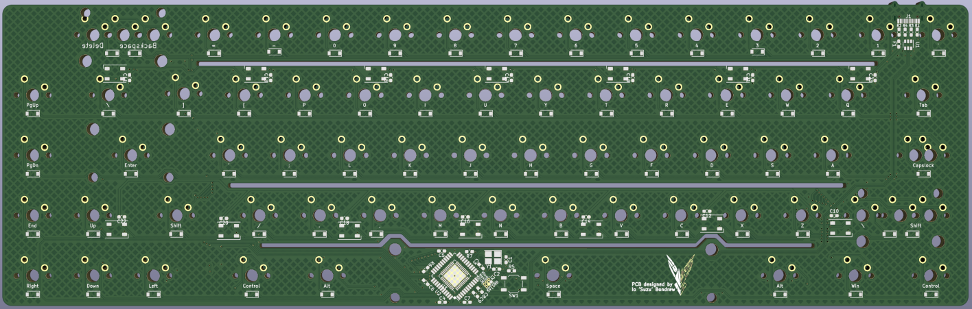
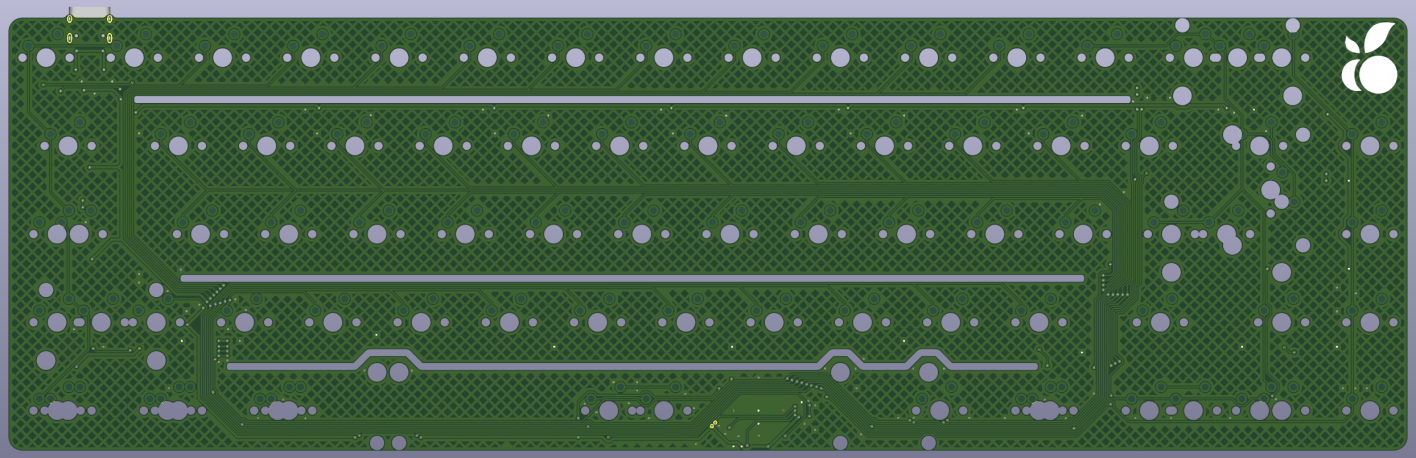
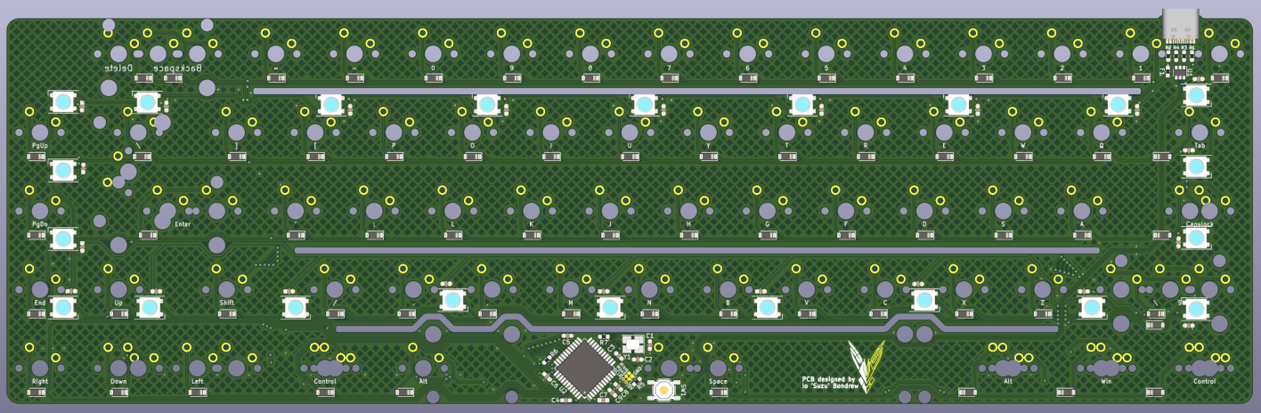
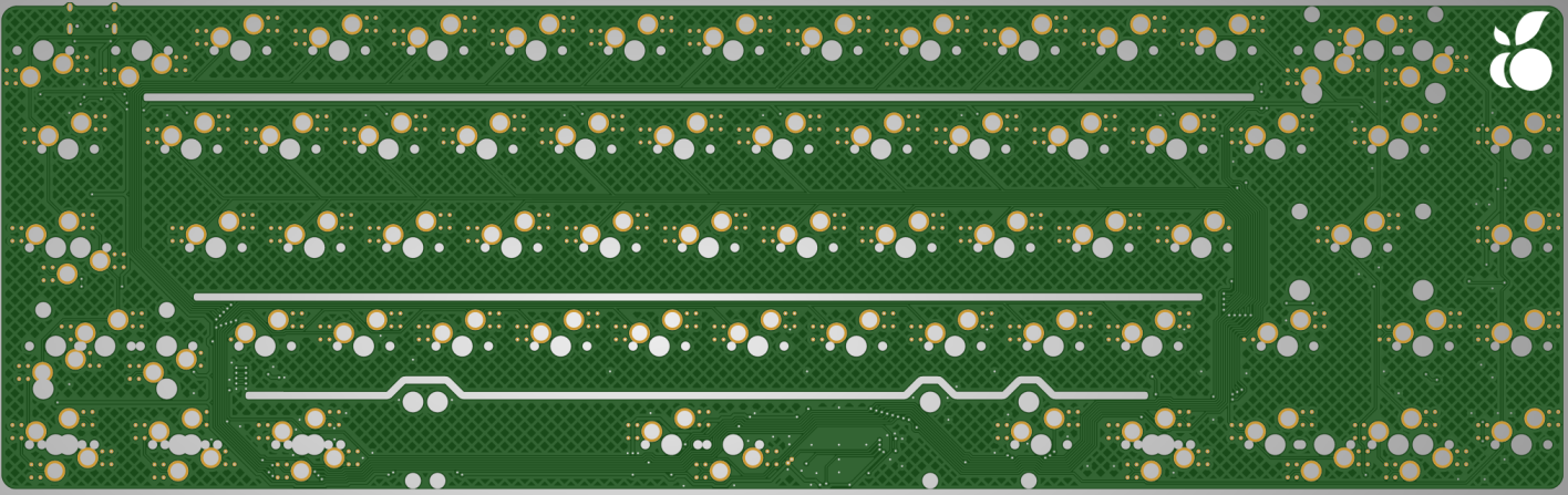
PCB Revisions (A → E)
Iteration snapshots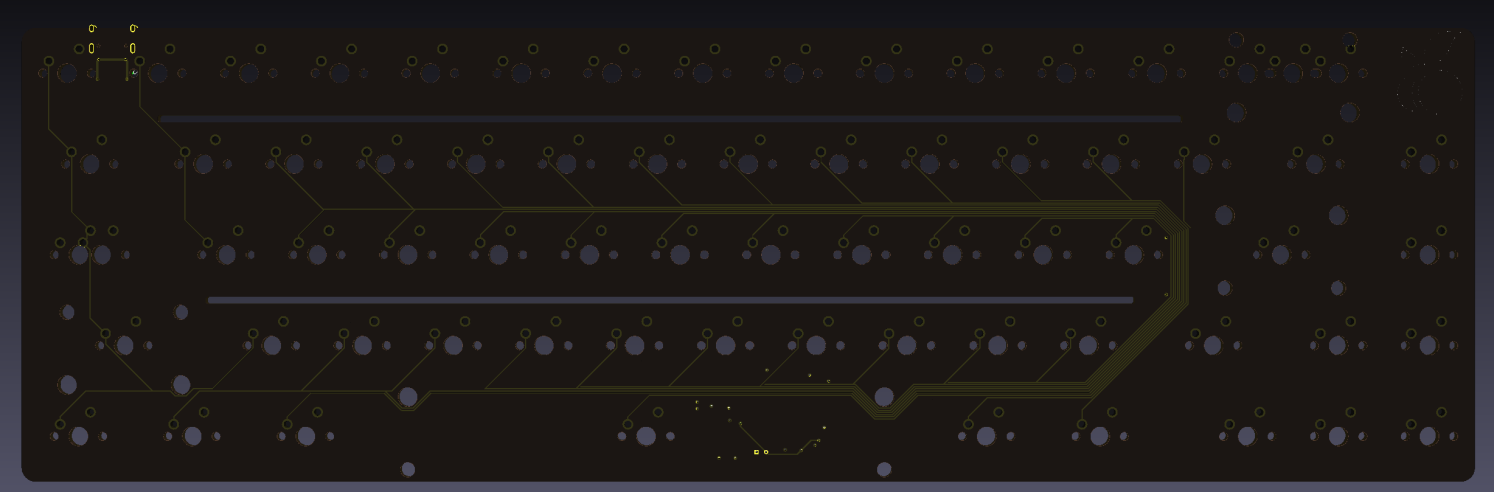
Revision A
Revision B
Revision C
Revision D
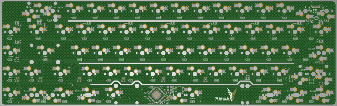
Revision E
Key changes across revisions:
- WS2812 underglow placement refined for cleaner side diffusion and fewer hotspots
- Flex relief cuts added to tune feel while protecting structural areas
- ISO and Tsangan layout options integrated without breaking routing constraints
- Microcontroller repositioned as routing and connector placement evolved
- Ground strategy improved across revisions (fill and stitching updates)
- Rev E: Kailh hot-swap sockets finalised for serviceability and build consistency
Web UX Deliverables
Two web surfaces shipped with the product: storefront UX and a self-serve assembly guide to reduce support.
Storefront UX
- Information order: value → what’s included → options → shipping/FAQ → checkout confidence
- Reduced ambiguity with “what’s in the box” and clear timelines
Storefront UI set: hero, product page, what’s-in-box, shipping/FAQ, checkout flow.
Assembly Guide UX
- TOC designed for fast scanning
- Step layouts emphasise “what you should see” and common failure modes
- Troubleshooting reduces repetitive tickets
Guide UX: TOC + step pages + troubleshooting patterns, designed for fast, error-proof assembly.
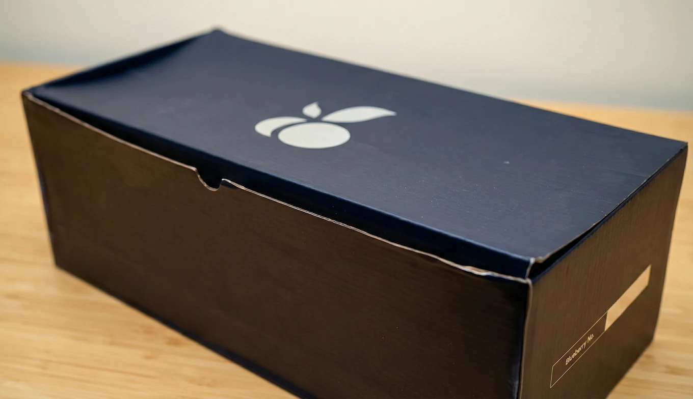
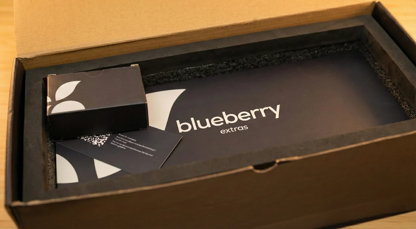
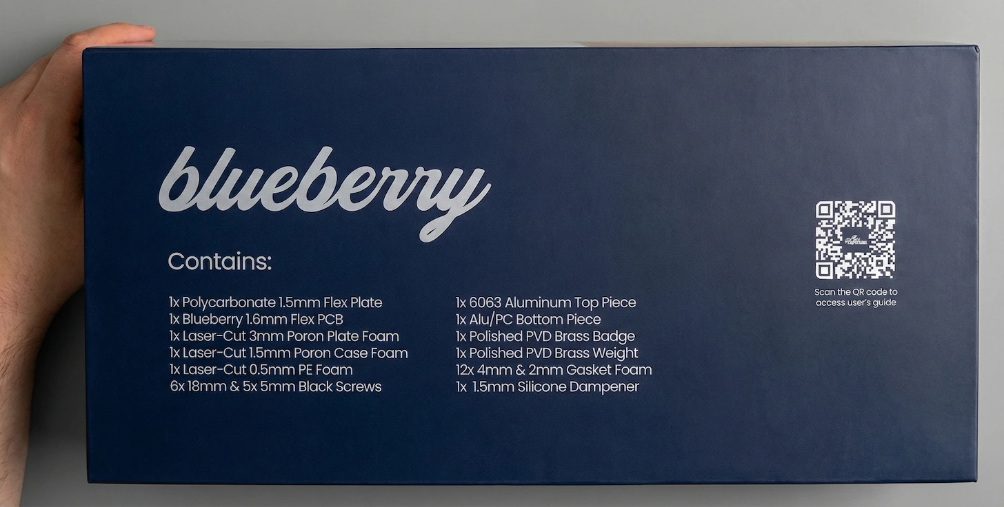
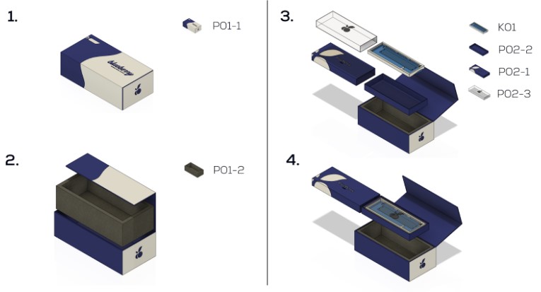
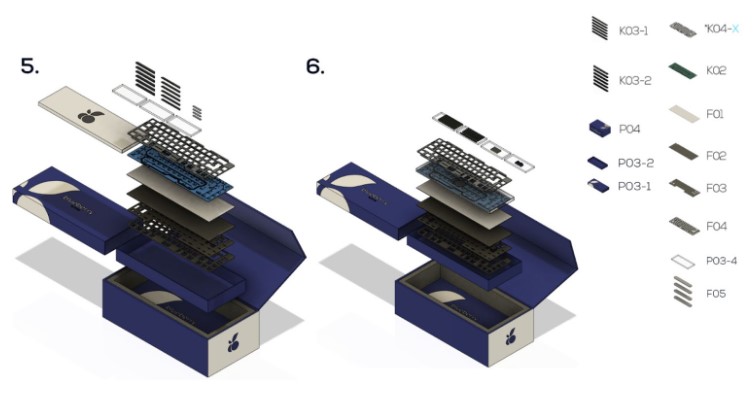
Packaging as a Product Feature
Packaging was a customer-facing deliverable: it had to survive shipping, look premium on camera, and protect the product. We iterated from a flawed v1 to a production-ready v2.
Looked cheap, arrived damaged, reduced protection
- Corrugated cardboard + rough finish → “budget” feel in hand and on video
- Silver print looked cheap under lighting
- Internal boxes didn’t fill the interior → lid collapsed in transit
- Frequent dents/folds → poor first impression and reduced protection
- Reviewers criticised packaging; unboxings often showed damage
Impact: Packaging weakened perceived quality and increased risk during shipping.
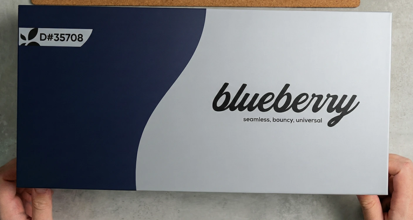
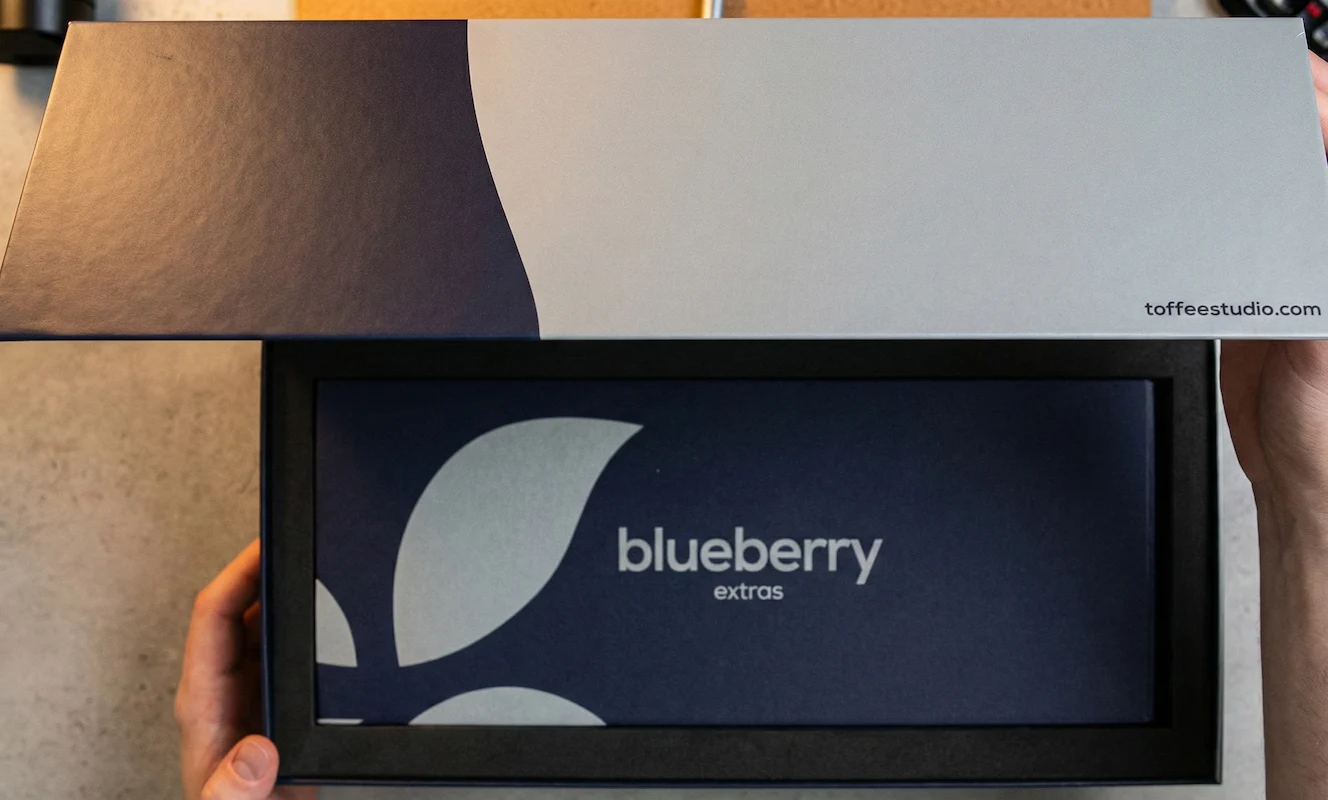
Modern, camera-friendly, and crush-resistant
- Smooth rigid paper-wrap finish (premium “book-style” feel)
- Modern graphic system with a wave motif matching the board’s silhouette
- White print (cleaner under lighting) replacing silver
- Repacked internals: filled-to-brim + reduced box height → no more crush
- Magnetic front closure for a satisfying snap
Also added: Blueberry-branded tape + thank-you card for brand cohesion.
Result: Stronger protection + premium unboxing + consistent presentation in videos.
Key changes
Operations Reality
What it took to ship, recover trust, and keep support sustainable.
01Creator Seeding
Pre-launch- Sent full sample units (packaging + components) to paid creators
- Briefed filming angles + sound + unboxing moments
- Goal: third-party proof pre-sale
Result: Credibility accelerated vs brand-only content
02First Run via Own Store
Run #1- Ran sales on our own storefront (Squarespace)
- Community hype via Discord + updates cadence
- Long QC iteration before “ready”
Result: Momentum slowed by quality iteration time
03Payment Disruption
Incident- Stripe blocked payouts + refunded customers unexpectedly
- Lost fees + reconciliation overhead
- Required fast comms to protect trust
Result: Single-point-of-failure identified
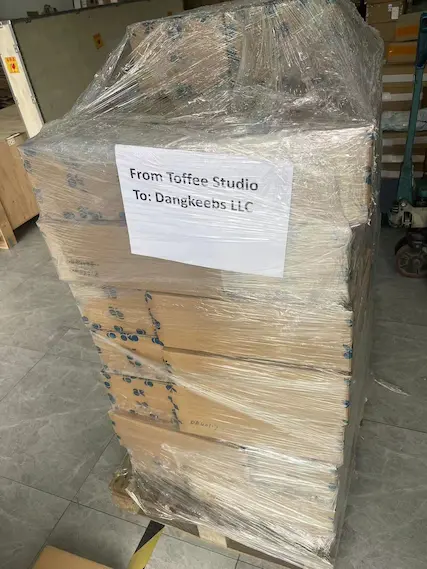
04Distribution Pivot
Run #2- Shifted to vendors: Chosfox, Keygem, Dangkeebs, ClickClack.io
- Rebuilt confidence + wider reach post-disruption
- Updated assets + listings + ops pipeline
Result: Stability improved through channel diversity
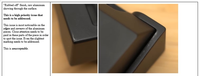
05QC / Batch Losses
Quality Gate- Batch failed stricter market QC expectations
- Downpayment + time lost; revised acceptance criteria
- Tightened QC gates + rework rules
Result: Repeat failure risk reduced
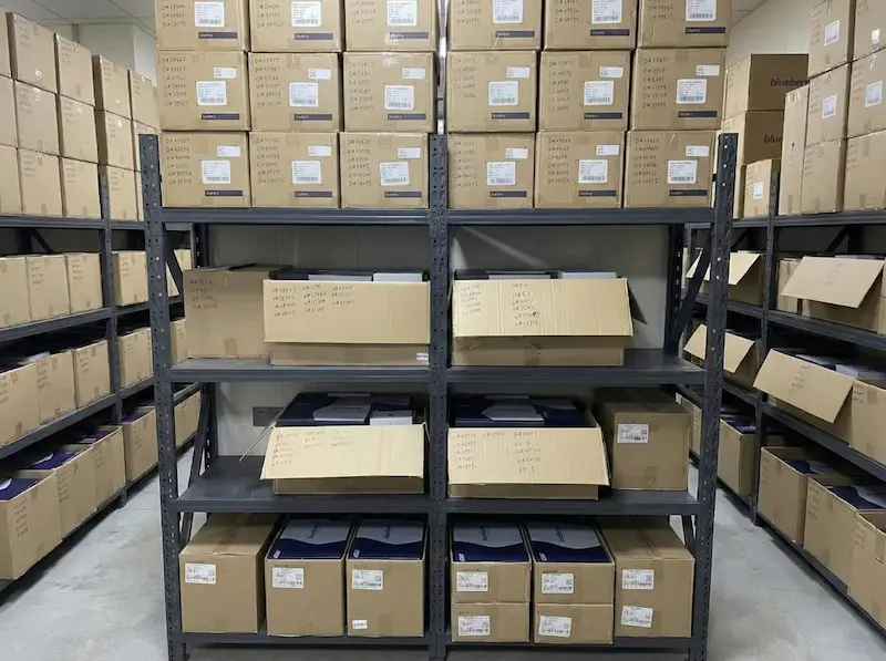
06Support & Extras (1 year)
Sustain- Shopify “extras” store for ongoing inventory
- Replacements, troubleshooting, follow-ups
- Built repeatable triage + shipping flow
Result: Support load became predictable
Operations Snapshot
Factory-ready SOPs for repeatable packing + QC.
Acceptance criteria tightened after batch losses.
What this system optimised
Reduced uncertainty during delays and made fulfilment + support repeatable under real constraints.
Retrospective
What I’d Do Again
- Creator-led credibility strategy
- High-quality visual kit for fast content output
- Community-first communication cadence
- Assembly guide to reduce support friction
What I’d Do Differently
- Payment redundancy from day one
- Clear QC acceptance criteria earlier
- Shorter cycle between hype peak and purchase moment
- Buffer time for manufacturing iteration loops